
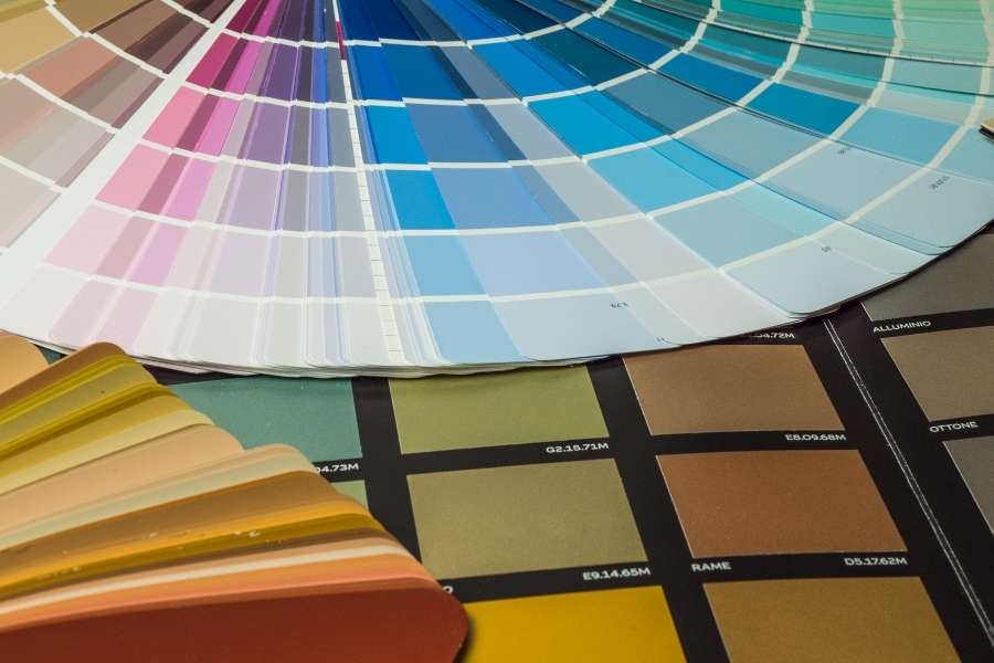
Stepping into a new home feels like facing a blank canvas. It is both exciting and a bit scary. The colors you choose will talk to you every morning. They will also hug you every single evening. Selecting the Right Color Palette is not just about following trends. It is about your emotions and the physics of light. Have you wondered why some houses feel like a warm embrace? Others might feel as cold as a hospital waiting room. The secret usually lies in your interior color choices. These shades interact with the unique soul of your building. Every successful home painting project requires a very clear vision. You should not pick a room color scheme in total isolation. Your home is a living ecosystem that needs a flow. Every wall paint choice must serve a very specific purpose.
Table of Contents
The Foundation of a Cohesive Home Painting Strategy
Professional design starts with a solid master plan for unity. Many homeowners treat each room like a separate, lonely island. This often creates a jarring experience in the hallway. You must learn how to create a cohesive color palette throughout your entire home. Start by selecting a consistent neutral color as an anchor. This visual thread connects all your different living spaces. It allows you to experiment with a daring accent color. You can use interior design technologies for a smart home to visualize these changes. Think of your neutral color as a steady musical beat. It allows the lead instruments to shine and sparkle. Without that base, your home music becomes very chaotic.
| Room Type | Recommended Base Tone | Psychological Impact |
| Living Area | Warm Greige | Welcoming, balanced, and versatile |
| Master Suite | Soft Sage or Dusty Blue | Reducing heart rate and promoting sleep |
| Home Office | Muted Terracotta or Navy | Enhancing focus and creative groundedness |
| Kitchen | Crisp White or Pale Oak | Feeling of cleanliness and natural light |
Mastering the Living Room with a Modern Interior Color Approach
The living room is the true heartbeat of the home. It is where stories are told and shared. You must balance beauty with high-traffic durability for success. This is a key part of the Right Color Palette. You might explore the latest trends in interior design for 2024 for fresh inspiration. A popular color combination uses deep charcoal or forest green. Pair these against a backdrop of soft, creamy wall paint. This creates depth and prevents an uninspired, flat feeling. Lighting plays a massive role in your final results. The Right Color Palette shifts between noon and sunset. Shadows can change how we see a neutral color.
Test your interior color samples on multiple walls. See how the shadows fall at different hours. Consider the undertones of your existing wooden flooring. Finalize your room color scheme after a full day. Mirror the natural landscape outside your large windows.
Solving the Puzzle of How to Pick the Right Paint Color for a Small Dark Room
Small rooms with no windows are a common challenge. Many people think bright white is the only solution. However, white can look dingy in a dark space. You must learn how to pick the right paint color for a small dark room. The Right Color Palette should embrace the natural shadows. Use warm, reflective pigments to bounce the light around. A soft neutral color can transform a cramped corner. It turns a dark spot into a sanctuary. Do not be afraid of using mid-tone shades. Sometimes a deeper room color scheme makes walls disappear. This can actually make a small room feel larger.
The Science of Serenity Which Wall Colors Make a Bedroom Feel Calm and Relaxing
Your bedroom is your ultimate sanctuary for deep rest. Colors here should be chosen with clinical precision. You want to know which wall colors make a bedroom feel calm and relaxing. Cool tones are usually the best choice. Muted blues and soft greens help lower heart rates. The Right Color Palette for bedrooms avoids high energy. Do not use bright red or neon yellow. These can overstimulate your brain during the night. A good color combination uses Oyster on three walls. Add a misty blue accent color behind the bed. This creates a peaceful and very modern look.
| Color Category | Specific Shade Example | Best For |
| Cool Tones | Sky Blue, Lavender, Mint | Bedroom, Bathroom, Nursery |
| Warm Tones | Ochre, Sand, Peach | Dining Room, Kitchen, Entryway |
| Moody Tones | Emerald, Slate, Espresso | Library, Media Room, Powder Room |
Frequently Asked Questions about Right Color Palette
What is the easiest way to ensure a room color scheme looks professional?
Follow the 60-30-10 rule for perfect visual balance. 60% is your dominant neutral color choice. 30% is a secondary color combination or texture. 10% is your bold and fun accent color.
How do I choose the Right Color Palette if I have dark furniture?
Use a wall paint that provides a strong contrast. A light neutral color lets the furniture stand out. It prevents the room from feeling too heavy. This is a smart interior color strategy.
Can I use a bold accent color in every room of the house?
It is better to be very selective here. This maintains a cohesive color palette throughout your entire home. If every room is loud, your eyes tired. Pick one or two hero rooms.
Does the finish of the wall paint matter as much as the color?
Yes, the finish changes how we see color. A flat finish hides bumps but absorbs light. A satin finish reflects light and looks vibrant. Most designers recommend Eggshell for home painting.